
Content Menu
● Understanding Why Cereal Box Design Matters
● Core Design Principles For Cereal Boxes
● Material Choices For Paper‑Based Cereal Boxes
● Visual Storytelling On The Front Panel
● Color, Typography, And Emotional Tone
● Interactive And Playful Elements For Engagement
● Premium Touches: Finishes, Textures, And Special Themes
● Practical Design Process For Custom Cereal Boxes
● Shelf Impact And Line Consistency
● Emerging Trends In Cereal Box Design
● Practical Examples Of Design Decisions
● よくあるご質問
>> 1. How do colors influence perception for different cereal audiences?
>> 2. What materials are most common for modern cereal cartons?
>> 3. Are interactive back‑panel games still relevant today?
>> 4. How can premium finishes be used without overwhelming design?
>> 5. What is the typical development process for a new cereal box?
As someone who works every day with brands on カスタムボックス projects, I’ve seen how a well‑designed cereal box can quietly become one of the strongest levers for shelf impact, perception of quality, and repeat purchase. In this article, I’ll share practical design ideas and packaging insights drawn from hands‑on collaboration with food brands and from current best practices in paper‑based packaging. [echocartons.com]
Understanding Why Cereal Box Design Matters
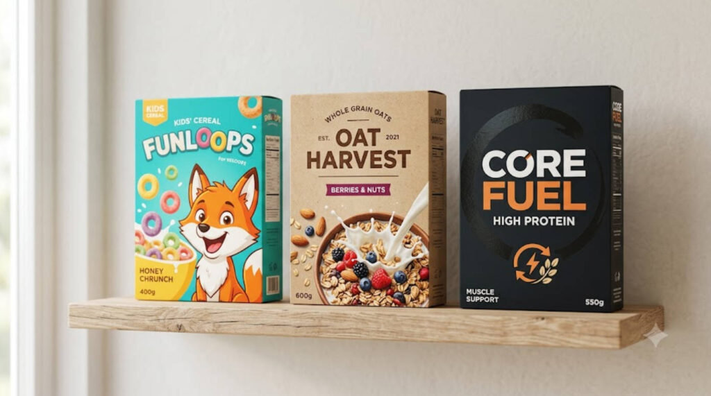
A cereal carton is not just a container; it is a compact storytelling surface that shapes how people feel about a product in seconds. Well‑planned layouts, materials, and finishes help products stand out on crowded shelves and guide shoppers toward confident choices. [diypack]
For brands, a consistent box system also supports line extensions, seasonal variants, and co‑branding without reinventing the entire visual language each time. When the structure, graphics, and on‑pack information work together, the result is a packaging asset that keeps performing long after a campaign ends. [customboxmakers]
Core Design Principles For Cereal Boxes
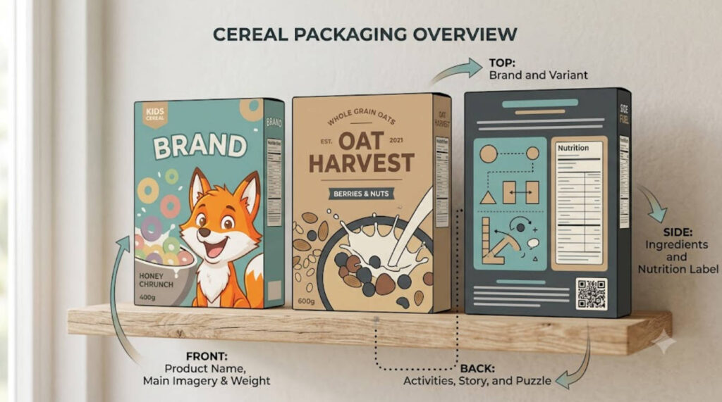
Strong cereal packaging usually balances three priorities: clarity on the front panel, emotional connection in the visuals, and trustworthy detail around the sides and back. From my experience working with cartons and paperboard, the most successful boxes tend to follow a few simple rules. [blog.diypack]
– Prioritize legible hierarchy on the front: product name first, key benefit second, support visuals last. [echocartons.com]
– Use a restrained color palette that reinforces brand recognition and keeps typography readable under retail lighting. [diypack]
– Reserve at least one panel for clear, uncluttered information, including ingredients, nutrition, and preparation suggestions. [echocartons.com]
This combination helps both quick shoppers and detail‑oriented buyers navigate the box easily and feel comfortable putting it in their cart. [customboxmakers]
Material Choices For Paper‑Based Cereal Boxes
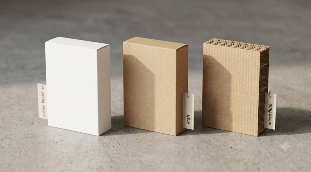
Most cereal cartons today are built around paper‑based structures that balance print quality, structural integrity, and end‑of‑life performance. Common options include cardboard, paperboardそして kraft‑based stocks, often paired with an inner barrier or bag for freshness. [customboxmakers]
From the standpoint of a custom box manufacturer, three material families dominate cereal applications. [blog.diypack]
– Folding carton board: smooth printing surface, ideal for vivid imagery and tight registration on small type. [customboxmakers]
– Corrugated micro‑flute: used selectively for heavier or multi‑pack cereals that demand greater stacking strength. [customboxmakers]
– Kraft‑toned board: increasingly chosen by brands that want a natural, minimally processed look tied to whole‑grain or organic positioning. [blog.diypack]
Where necessary, brands add thin inner liners or barrier films to maintain crispness and protect aroma, while keeping the outer box fully printable. [echocartons.com]
Visual Storytelling On The Front Panel
Front panels carry the fastest message: what the cereal is, who it’s for, and why it deserves attention. When we develop custom boxes at the manufacturing level, we typically start by locking three elements before anything else. [buddypackaging.co]
– A dominant product name set in a clean, readable font that can be recognized from several meters away. [diypack]
– A support visual – often a bowl shot or ingredient illustration – that reinforces flavor and texture cues. [diypack]
– One short, benefit‑oriented phrase, such as “high in fiber” or “whole‑grain crunch,” placed near the logo. [echocartons.com]
Careful alignment of these parts reduces visual noise and helps shoppers decode the box in a glance rather than having to read deeply before deciding. [diypack]
Color, Typography, And Emotional Tone
Colors and typefaces carry emotional weight, especially in breakfast categories that span kids, adults, and specialty diets. Bold contrasts such as orange with blue or red with yellow can signal energy and fun, while muted greens and browns suggest wholesomeness and restraint. [designerpeople]
On children‑oriented boxes, we often see large, rounded fonts paired with lively mascots, while adult‑focused products lean toward more restrained type systems and minimalist icons. The most resilient designs retain a consistent typographic backbone across all variants, allowing flavor changes or seasonal art without confusing long‑time customers. [thecustomboxes]
Interactive And Playful Elements For Engagement
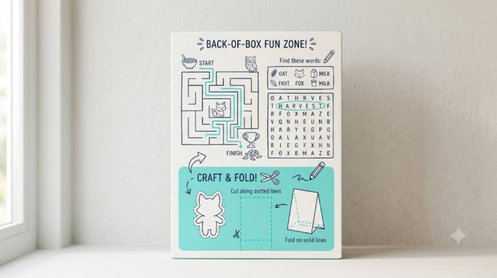
One long‑standing strength of cereal packaging is the ability to turn the box into a small interactive space. Games, puzzles, and simple challenges on back or side panels can extend attention time and create small rituals at the breakfast table. [echocartons.com]
Brands commonly use: [designerpeople]
– Maze or word search panels that align with the theme of the cereal. [echocartons.com]
– Simple collect‑and‑complete series, encouraging families to keep buying variants to finish a set of activities. [designerpeople]
– Instructional graphics that explain how to fold, cut, or reuse parts of the box for craft projects. [blog.diypack]
From a manufacturing standpoint, these additions are mainly a matter of print planning: they typically do not change tooling but can significantly increase perceived value of the carton. [blog.diypack]
Premium Touches: Finishes, Textures, And Special Themes
For higher‑priced cereals or limited releases, finishes become an important lever. Spot gloss, soft‑touch coatings, and selective metallic inks can be used to emphasize logos or key claims without overwhelming the main artwork. [customboxmakers]
Similarly, themed runs for events or holidays allow brands to temporarily adjust box graphics without deviating from their core structure. Many teams now plan a year‑round calendar that covers at least one major seasonal refresh, timed to key consumption peaks. [thecustomboxes]
Practical Design Process For Custom Cereal Boxes
Behind every finished carton is a sequence of structured decisions. In manufacturing projects, the most efficient teams tend to follow a simple, repeatable process that keeps creative ideas grounded in what can be produced reliably. [buddypackaging.co]
1. Clarify packaging objectives – protection level, shelf environment, and core audience. [buddypackaging.co]
2. Select structure and materials – board grade, flute (if any), and inner barrier options. [customboxmakers]
3. Map information architecture – front, sides, and back panels with specific roles. [buddypackaging.co]
4. Develop artwork and typography in line with brand guidelines, with prototypes tested under retail lighting. [buddypackaging.co]
5. Run print trials and structural samples to validate color, cut accuracy, and folding performance. [customboxmakers]
Working closely with a custom box producer during these steps reduces late changes and ensures that design intent survives all the way to mass production. [buddypackaging.co]
Shelf Impact And Line Consistency
On retail shelves, cereal boxes rarely stand alone; they form blocks of color and shape that either reinforce or dilute the brand. A coherent visual system helps every SKU build on the others’ presence, especially where several flavors share one facing. [thecustomboxes]
Successful line design typically keeps: [diypack]
– Shared core elements such as logo position, main type family, and base layout grid.
– Controlled flexibility for flavor graphics, mascots, or accent colors, so shoppers can read differences at a glance.
– Clear vertical or horizontal rhythms that look orderly from a distance but remain engaging up close.
For manufacturers, this consistency also simplifies die‑cutting and folding operations, since multiple designs can run on the same tooling with only print plate changes. [customboxmakers]
Emerging Trends In Cereal Box Design
Recent projects across food packaging point toward a few broad trends that are reshaping how cereal boxes are developed. [vistaprint]
– More emphasis on natural textures – kraft tones, simple line art, and ingredient photography that feels less staged. [vistaprint]
– Growing interest in compact formats and stand‑up structures, especially where brands experiment with pouches and hybrid boxes. [designerpeople]
– Increased use of data‑driven iteration, with box variants tested in small runs based on sell‑through and shopper feedback before wider rollout. [vistaprint]
For brands partnering with custom box specialists, these trends often translate into more frequent but smaller design updates, keeping packaging aligned with changing expectations without overhauling the entire system at once. [vistaprint]
Practical Examples Of Design Decisions
To make these ideas more concrete, the table below compares three typical cereal box directions and how their design choices differ in practice. [designerpeople]
| Box type | Primary audience | Visual tone | Key front elements | Typical material |
|---|---|---|---|---|
| Kids’ character cereal | Children and families echocartons.com | Bright, playful, energetic echocartons.com | Large mascot, bold name, fun claim echocartons.com | Folding carton board with vivid inks customboxmakers |
| Adult whole‑grain cereal | Health‑motivated adults echocartons.com | Calm, natural, restrained echocartons.com | Ingredient imagery, benefit badge, simple logo echocartons.com | White or kraft board, minimal coating customboxmakers |
| High‑protein or premium cereal | Fitness and premium buyers echocartons.com | Dark, sleek, focused echocartons.com | Strong wordmark, numeric protein callout, minimal art echocartons.com | Heavier board, selective special finishes customboxmakers |
These are not rigid templates, but they illustrate how different audiences drive concrete differences in structure, color, and surface treatment. [designerpeople]
よくあるご質問
1. How do colors influence perception for different cereal audiences?
Brighter, high‑contrast colors usually connect with younger audiences and playful themes, while muted earth tones and clean whites tend to resonate with adults who prioritize calm, natural cues. Matching the palette to the intended breakfast experience makes it easier for shoppers to recognize whether a product fits their routine. [designerpeople]
2. What materials are most common for modern cereal cartons?
Most boxes rely on folding carton board or similar paperboard, sometimes with micro‑flute inserts for heavier multi‑packs, paired with an inner bag or liner for freshness. Brands that lean into a natural look may select kraft‑toned stocks that visually reinforce whole‑grain or minimally processed positioning. [blog.diypack]
3. Are interactive back‑panel games still relevant today?
Yes, activity panels remain a simple, low‑cost way to increase engagement, particularly for family and children’s cereals. Word searches, mazes, and small challenges can extend the time people spend with the box and create small rituals that strengthen familiarity with the brand. [echocartons.com]
4. How can premium finishes be used without overwhelming design?
Selective techniques such as spot gloss, soft‑touch coatings, or subtle metallic accents work best when limited to logos or key product claims. Keeping the majority of the surface matte or lightly coated preserves readability and prevents glare under retail lighting. [diypack]
5. What is the typical development process for a new cereal box?
Teams usually start by defining packaging goals and target shoppers, then choose structure and materials, map panel content, and build artwork prototypes. After test prints and structural samples are evaluated, final adjustments are made before mass production, ensuring that both visual intent and functional needs are met. [buddypackaging.co]
References
1. Oxo Packaging – “7 Creative Cereal Box Design Ideas to Make Your Brand Stand Out.” [page:1]
2. Buddy Packaging – “Step‑by‑Step Guide to Designing Custom Boxes for Your Products.” [Link]
3. DIYPack – “7 Tips for Designing a Custom Packaging Box.” [Link]
4. DIYPack – “5 Custom Product Box Design Tips That Help Your Brand Stand Out.” [Link]
5. VistaPrint – “Box Design Tips For Custom Packaging.” [Link]
6. Custom Box Makers – “Product Packaging Design Guide: Materials, Dielines, Prints.” [Link]
7. The Custom Boxes – “Box Design 101: A Beginner’s Guide to Perfect Packaging Box Design.” [Link]
8. Designer People – “Cereal Packaging Design Ideas That Attract Every Age Group.” [Link]
Hot Tags: Custom Box, Manufacturers, Customized, Custom, Suppliers, Buy, Cheap, Quality, Advanced, Durable, in Stock, Made in China, Price, Quotation, Free Sample
 English
  Spanish
  French
  German
  Russian
  Japanese
  Portuguese
  Arabic