
Effective packaging design does more than make a product look attractive. For a premium paper box, it must communicate the brand, protect the product, work in production, and make the customer’s experience feel intentional. The six familiar elements—shape, inserts, color, typography, imagery, and branding—are a useful starting point. The strongest custom packaging designs connect them to material choice, shipping conditions, print proofing, and credible claims.
Почему дизайн упаковки имеет значение
A 2018 Ipsos survey of 2,002 U.S. adults found that 72% said packaging design often influenced their purchase decisions, while 67% said the same about packaging materials. The finding supports treating packaging as part of the buying experience—not as proof that a particular box design will increase sales.
For a brand commissioning custom paper packaging, the practical question is: What must the box accomplish? A gift box may need to create a memorable reveal. An e-commerce box may need to arrive without crushed corners. A retail carton must help shoppers identify the product quickly and leave room for scannable information. Often, one package must do all three.
Six Core Packaging Design Elements
1. Choose a Structure That Fits the Product
Begin with the product’s dimensions, weight, fragility, and presentation needs. A folding carton may suit a lightweight retail item. A rigid box can support a more deliberate gift-opening experience. A sleeve can add a branded layer without replacing the primary box.
Do not select a style from a mockup alone. Ask for a physical sample and test how the item sits inside it. Check clearance, lid resistance, opening direction, and whether the structure remains practical once the product, insert, and printed information are added.
2. Design Inserts for Protection and Presentation
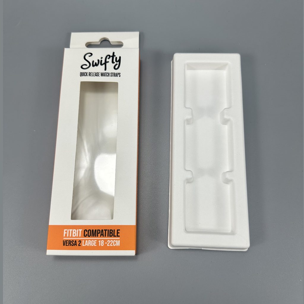
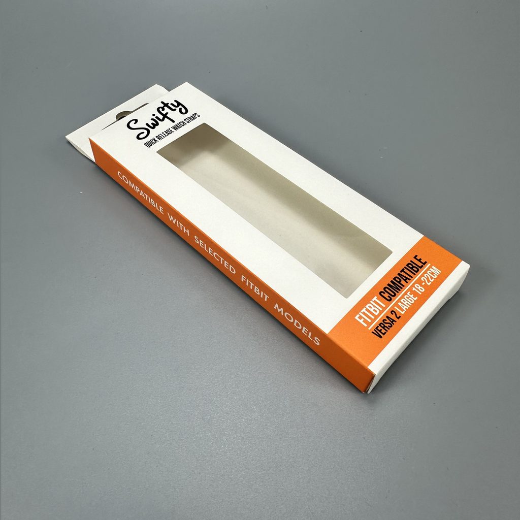
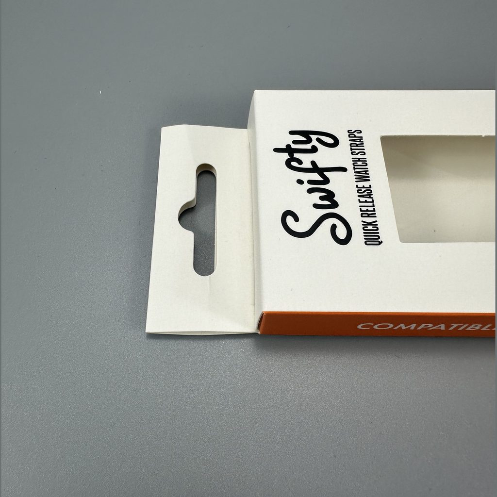
An insert should keep the product in position and guide the first view when the box opens. Its material and cutout must suit the actual item—not just an idealized rendering. A window or handle may improve presentation, but either can also change the structure’s strength or usable print area.
For fragile products, test the complete packed configuration: product, insert, box, closure, and any shipping carton. If the retail box will travel inside a separate shipper, evaluate that arrangement rather than assuming the decorative box alone will provide transit protection.
3. Specify Colors for the Printed Material
Color establishes recognition, but a screen preview is not a production standard. Paper stock, surface finish, ink choice, and printing method can all affect the result. Set a physical color reference for the most important brand colors and approve a proof on the intended material when possible.
CMYK process printing and specified spot colors are not interchangeable promises. Pantone’s Color Bridge, for example, compares spot colors with their closest CMYK equivalents—useful when deciding whether a process-print approximation is acceptable.
4. Make Typography Easy to Scan
Give each panel a job. The front should identify the brand and product; other panels can carry supporting details and required information. Use type size, contrast, and spacing to establish a clear reading order.
Review the design at actual printed size. A headline that looks restrained on a large monitor may dominate a small carton, while fine text can become difficult to read. Reserve space for information that must remain legible after folds, finishes, or labels are applied.
5. Use Imagery With a Clear Purpose
Photography, illustration, patterns, and empty space should help the buyer understand the product or recognize the brand. More graphics do not necessarily create a more premium result. For some products, a precise logo and well-chosen material convey more than a crowded panel.
Ask what each visual contributes. Does it show the product accurately? Explain a feature? Distinguish one variant from another? If not, consider removing it. Then inspect a printed sample for image detail, alignment, and consistency across panels.
6. Keep Branding and Functional Details Together
A logo is only one part of packaging identity. The opening sequence, inside print, material feel, and tone of voice also shape recognition. At the same time, the design must accommodate barcodes, product details, and any applicable market-specific labeling requirements.
For checkout packaging, GS1 US generally recommends placing the barcode on a smooth area toward the lower-right back panel, away from edges, with clear space around the symbol. Treat that space as a design requirement from the first dieline—not something to squeeze in at final approval.
What the Six-Element Checklist Misses
The original six-element framework is helpful for visual planning, but it leaves three decisions underdeveloped: how to verify the finished box, how to substantiate sustainability claims, and how to compare design options against real use conditions. Those decisions often determine whether attractive custom packaging is ready to order.
Test the Experience Before Approving It
A flat artwork proof checks text and layout; it cannot fully show how a box feels in hand. Request a physical prototype with the proposed insert and product. Have someone unfamiliar with the design open it without instructions.
Watch for hesitation. Is the opening obvious? Does the product lift out easily? Are important details hidden by a flap? Does the box still close properly after the product is returned? Record what happens and revise the structure before committing to production.
Make Material Claims Specific
Paper-based packaging should not automatically be described as “eco-friendly” or “recyclable everywhere.” Claims depend on the package’s components and the markets where it is sold. The U.S. FTC’s Green Guides caution against broad, unqualified environmental-benefit claims and call for appropriate support and qualifications for recyclable claims.
If an FSC label is proposed, confirm the certified material, documentation, and chain-of-custody requirements before approving the artwork. FSC explains that its finished-product label depends on requirements being met along the supply chain; a supplier’s general interest in responsible sourcing is not, by itself, permission to place the mark on a box.
Compare Designs Against a Brief
A beautiful sample is not enough to settle a packaging decision. Give every concept the same review criteria, then document trade-offs before requesting revisions.
| Review criterion | Question to ask |
|---|---|
| Product fit | Does the packed item stay secure without awkward empty space? |
| Brand recognition | Can a buyer identify the brand and product quickly? |
| Customer experience | Is opening, removing, and replacing the item straightforward? |
| Производство | Can the selected board, print, and finish reproduce the design consistently? |
| Distribution | Has the packed configuration been checked for its intended shipping route? |
| Claims and labeling | Are barcode space, required copy, and material claims verified? |
A Practical Custom Packaging Workflow
1. Write the brief. List product dimensions, sales channel, target customer, desired impression, and distribution conditions.
2. Choose the structure. Compare styles using the actual product, not an empty sample.
3. Build the information hierarchy. Decide what a buyer must notice first and what belongs on secondary panels.
4. Specify materials and print. Agree on board, finish, color references, and any insert before judging the final look.
5. Prototype and test. Review opening, fit, appearance, and the packed shipping arrangement.
6. Approve production files. Check copy, dielines, barcode placement, and any certification artwork against the final specification.
For a premium skincare set, for instance, a rigid paper box might create the desired reveal, while a fitted insert holds each item in position. That concept should still be judged on whether customers can remove the products easily, whether the printed color matches the approved sample, and whether the complete pack suits its delivery method. Premium is an outcome of coordinated decisions, not a finish applied at the end.
Plan Your Box With Bonito Packaging
If you are developing custom paper packaging, send Bonito Packaging your product dimensions, quantity, reference artwork, target market, and shipping requirements. Ask for a structure and material recommendation, a prototype review plan, and a clear list of items to approve before production. That gives your team a more useful starting point than choosing a box by appearance alone.
Часто задаваемые вопросы
1. What is the most important element of packaging design?
There is no single element for every product. Start with product fit and protection, then build the visual design and customer experience around those requirements.
2. Is a rigid box always better for premium products?
No. A rigid box may suit a gift-led presentation, but a well-designed folding carton can be the better choice when storage, packing, or distribution needs differ.
3. Should custom packaging use CMYK or spot colors?
Choose according to the artwork and the acceptable color match. Compare the proposed printed result on the intended stock before approving a critical brand color.
4. When should an insert be designed?
Early—ideally alongside the box structure. The insert affects product position, opening experience, internal dimensions, and the finished pack.
5. Can I print an FSC logo on any paper box?
No. Confirm that the relevant materials and supply chain meet FSC requirements and that use of the mark is authorized before it enters approved artwork.
6. How do I make a recyclable packaging claim?
Check the finished package and the markets where it will be sold. Avoid an unqualified claim unless it is supported under the applicable guidance; components and access to recycling can matter.
References
1. [OXO Packaging, “6 Fundamental Elements of Effective Packaging Design”]. Source article for the original six-element framework; its claims and wording were independently reassessed. [oxopackaging]
2. [Ipsos, “Most Americans Say That the Design of a Product’s Packaging Often Influences Their Purchase Decisions”]. U.S. survey published in 2018; the article uses its reported design and material figures without treating them as a sales forecast. [ipsos]
3. [Pantone, “Color for Print and Packaging: Which Guide Is Right for You?”]. Basis for the distinction between spot colors and CMYK equivalents. [пантон]
4. [GS1 US, “Barcode Placement & Printing Guidelines”]. Guidance on barcode position, print contrast, and quiet zones. [gs1us]
5. [U.S. Federal Trade Commission, *Guides for the Use of Environmental Marketing Claims*]. Guidance on substantiating and qualifying environmental claims. [ftc]
6. [Forest Stewardship Council, “Chain of Custody Certification”]. Explanation of supply-chain requirements relevant to FSC-labeled finished goods. [fsc]
 English
  Spanish
  French
  German
  Russian
  Japanese
  Portuguese
  Arabic